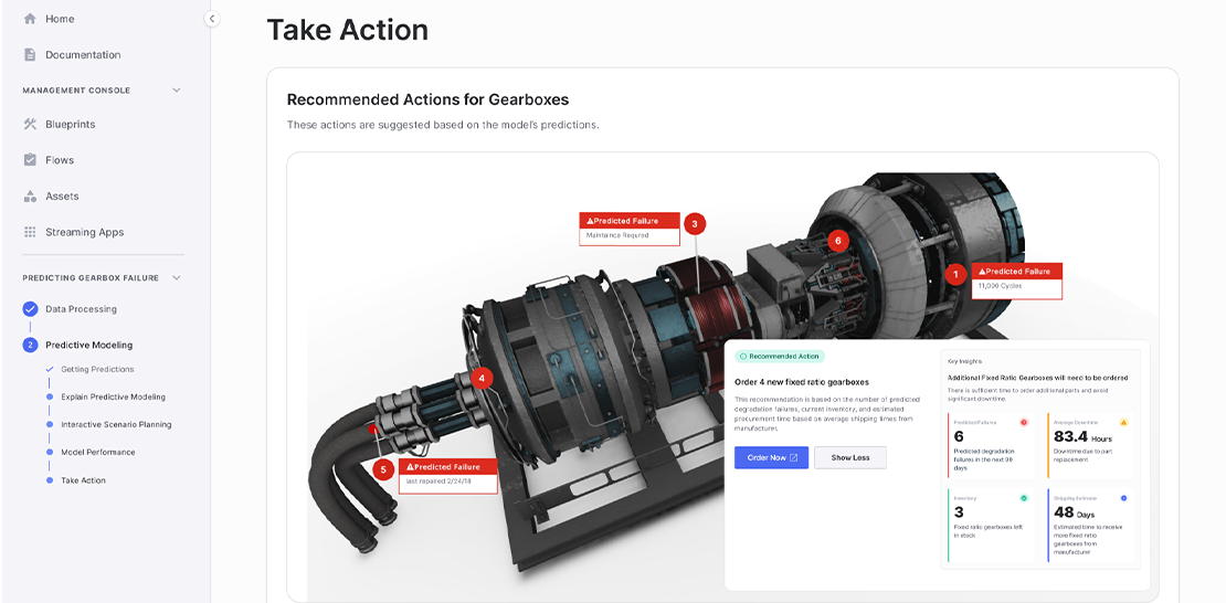
Data can often seem abstract, hindering the opportunity for it to be actionable. The sheer volume of data makes it difficult to understand what it all means. To remove these roadblocks to leveraging data for better decision-making, many companies rely on data visualization.
Data visualization is a graphical representation of information. With “visuals,” you have a more accessible way to connect the dots and uncover trends, outliers, and patterns. Thanks to this approach, you don’t have to be a data scientist to recognize the data’s story. You can more easily analyze your troves of data, leading to better, more informed results.
Data Visualization Is an Important Tool for Businesses
Humans are visual creatures. We all learn in different ways, but visualizations help us all comprehend faster.
Consider these two options: a graphical representation with color-coding that maps out data vs. a spreadsheet full of information. Which one is going to be more advantageous? Most people would agree that it’s the latter, which can work for anyone because most people who need to evaluate data to make decisions aren’t data scientists.
The ability to package up data is also critical because the amount of data generated daily is massive. In 2020, the data created, captured, copied, and consumed globally reached 64.2 zettabytes. By 2025, the expectation is that it will grow to 180 zettabytes. A variety of technology pieces are fueling this growth, including IoT (Internet of Things) devices, the proliferation of digital transformation in every industry, and the ability to track just about anything.
As a result of this avalanche of data, you need to organize and accelerate its speed to value with data visualizations. In such models, insights are easier to absorb.
Multi-Dimensional vs. Traditional Visualizations
Data visualizations aren’t a new concept. What’s happening now is the transition from 2D visualizations to 3D. Two-dimensional visualizations may occlude critical data points, meaning that the trends you hope to identify don’t stand out in many cases. It’s not much better than just looking at the rows in a spreadsheet.
Conversely, 3D visualizations enable users to explore the “why” behind the data. They can add and change up variables to observe how those will impact the target data.
This immersive data visualization takes the static and transforms it into a multi-dimensional experience that enables drill-downs and interaction. The model allows you to view the data from any angle. Having this type of tool provides any company with a path forward to data-driven decisions and helps solve various challenges, including siloed operational data, distributed team collaboration, and missed growth opportunities.
With these visualizations, you can break down complex data analysis on large datasets so that it’s possible to take action on the “why.”
Data Visualization Use Cases
Many verticals can find immense value in data visualizations. In determining when to use it, there are no written rules. Applying visualizations to large datasets makes sense, but they also work well when seeking to identify causation when there are many variables. Here are some use case examples from various industries or functions.
-
Sales: The sales pipeline is a big deal for organizations, but visibility into it for managers and leaders can be murky sometimes. The pipeline and deal stages are more apparent with data visualizations, improving forecasting and alignment with sales goals.
-
Marketing: Use data visualizations to understand consumer behavior to find out what influences it. By doing so, you can better target your audience.
-
Energy: Data visualization is driving change in the energy sector, supporting forecasting, root cause analysis, predictive maintenance, and more.
-
Healthcare: Both payers and providers want to learn more about data regarding the health of patients. Data visualizations can support a variety of stakeholders. Providers can develop 3D visualizations to understand public health trends more clearly and improve patient care. Payers could use these to more reliably predict the potential for certain claims.
-
Biotech: Researchers can manage large datasets through 3D models and insert different variables when developing new medications. That can continue to add new data based on trials to find “aha” moments.
-
Finance: Financial institutions can leverage visualizations in many ways, from business intelligence to fraud identification.
-
Transportation and logistics: Better routing saves companies time and money. With 3D visualizations, they can incorporate all types of data—fuel sensors, mileage logs, GPS, and so on—to find the most efficient routes.
-
Defense: In the defense field, predictive maintenance data visualizations help reduce downtime and maintenance costs.
How Can Data Visualizations Move Your Organization Forward?
With the right technology platform, data visualizations don’t have to be complex. You can create environments to discover new dimensions of data never accessible before.

.png)