.png)
Written by Virtualitics
Oct 10, 2022 11:49:50 AM

We’ve been exploring data the same way for so long that we’ve stopped recognizing how it’s holding us–and our businesses–back. It’s time to break free from outdated tools and the shortcuts they forced us to take and start doing things differently.
The RestrictionsWith so much data at our disposal, we should be able to investigate problems from every angle, but we don’t. Every analysis starts with a hypothesis and that hypothesis is used to narrow the scope of the exploration. From the data points we include in our data set, to the questions we ask of the data, to the conclusions that we spot, the hypothesis is always in the driver’s seat.
Given the limits of the analytic tools we had, it’s no surprise that analysts and data scientists have taken to using informed hypotheses to limit the scope of data exploration. But hypothesis-driven exploration has always injected some risk and, as AI has amplified the potential uses of data, these risks have been amplified as well.
This blog is based on a presentation we delivered at the Gartner Data and Analytics Conference. Watch it here!
Hypothesis-Driven Exploration
So what is hypothesis-driven exploration? It’s when the data is explored with a particular hypothesis in mind:
| 1. Observe the problem (or opportunity) | Some orders keep arriving too late! |
| 2. Formulate a hypothesis | We have an issue with our supply chain |
| 3. Gather only the data relevant to that hypothesis | Explore the supply chain data |
| 4. Explore the data with that hypothesis in mind | Where is the weak link in our supply chain? |
| 5. Move forward with a project based on your results | Diversify the supply chain under certain circumstances. But are we targeting the right problem? Will this resolve the issue of late orders? |
Given the time and effort data exploration takes using traditional BI tools, it’s not a surprise that data scientists and analysts have leaned on hypotheses to keep project scope in check. It’s also just human nature–you have to focus your attention somewhere and it’s hard to set aside your theories to explore with an open mind. Even data scientists who develop AI algorithms to explore data will be directing their exploration using hypotheses to some degree or another.
But there are real risks to allowing a hypothesis to direct exploration:
- Missed Opportunities
You could be looking in the entirely wrong direction–what the problem is or how you should go about solving it. - Underwhelming AI or Meaningless Insights
Your exploration may yield some insight, but if it’s not insight about the real issue then any action you take will have weak or non-existent results. - Overlooked Risks
You may have left out data that pointed to big issues, or that could have left you to draw completely different conclusions. That means the real problems are left unchecked. - Biased AI
Conversely, limiting exploration could allow some data sources to have an outsized impact on the results.
Exploration should form the foundation for all of your data-driven initiatives but when it’s being done on the narrow premise of a hypothesis, everything built atop it is at risk. And when you’re planning to build AI that will automate business decisions across the enterprise, the repercussions of getting it wrong are just too great. There is a real cost to leaving insight on the table.
What Does Exploration with Today’s Tools Look Like?
The renowned Pew Research Center does a lot of great surveys and kindly makes not only their findings but their data available to the public. We thought it would be interesting to look at their 2021 survey data for Social Media Use their conclusions to help us illustrate the benefits of Intelligent Exploration.
Let’s start by looking at all of the data points that Pew gathered–it’s a lot!
| Gender Age Marital status Employment Income State Race Party Home internet Home internet kind Do you want high-speed at home? Does disability impact you? Parent of under 18 Education level |
Current cable TV Books read Printed books Audiobooks eBooks Internet user Smart device? Internet on device Internet frequency Social media use Twitter user Instagram user Facebook user |
Snapchat user YouTube user What'sApp user Pinterest user LinkedIn user Reddit user TikTok user NextDoor user Twitter frequency Instagram frequency Facebook frequency Snapchat frequency Youtube frequency |
Below are some of the key results that the Pew center found:
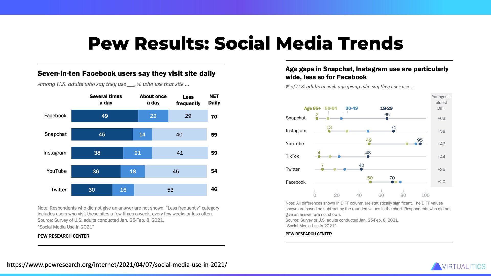
Facebook remains the most popular and most visited site. Snapchat has the highest age spread between users
These are interesting findings, but we’re not seeing any interactions between the dimensions. There’s no sense of who these respondents are or how the use of one platform relates to another. If you were an advertiser looking to leverage these platforms, your knowledge of the average user is pretty light.
And given the amount of data that was collected, the analysis is very simple 2-dimensional pivot tables. There’s also no way to tell if these differences are real (statistically significant) or just based on sampling bias. The BI used for dashboards and pivot table analysis are not very well suited for multidimensional exploratory data analysis.
Breaking Limits with Intelligent Exploration
Intelligent Exploration is the practice of using AI to explore and understand data. Many data scientists focus on throwing a lot of data at a problem and applying supervised ML techniques to sort it out. While this feels efficient, the number of failed AI projects–a number that has only inched up 2% in two years–would say that it’s not. But doing good, thoughtful exploratory analysis with the aid of AI purpose-built to do just that will de-risk projects and lead to more trusted outcomes.
Intelligent Exploration creates a more complete picture and facilitates better decision-making because:
- It can comb through complex datasets so that there’s no need to impose our own thoughts on what data should be included or not.
- Intelligent Exploration can not just look at more dimensions, but it can look at the many possible relationships between those dimensions.
- It cuts through the noise of complicated data and pulls out the significant insight, so data science teams know where to focus, instead of spinning cycles trying to find the ‘Aha!’ insight.
- AI has no preconceived ideas about what trends or relationships it will find, keeping human bias out of the exploration. This means that Intelligent Exploration may find relationships that people won’t even think to look for.
- Data quality is the single most important factor in an AI model. Every model that has gone off the rails has failed because it relied on either the wrong data or weak data. Intelligent Exploration is ideal for assessing data quality effectively and efficiently.
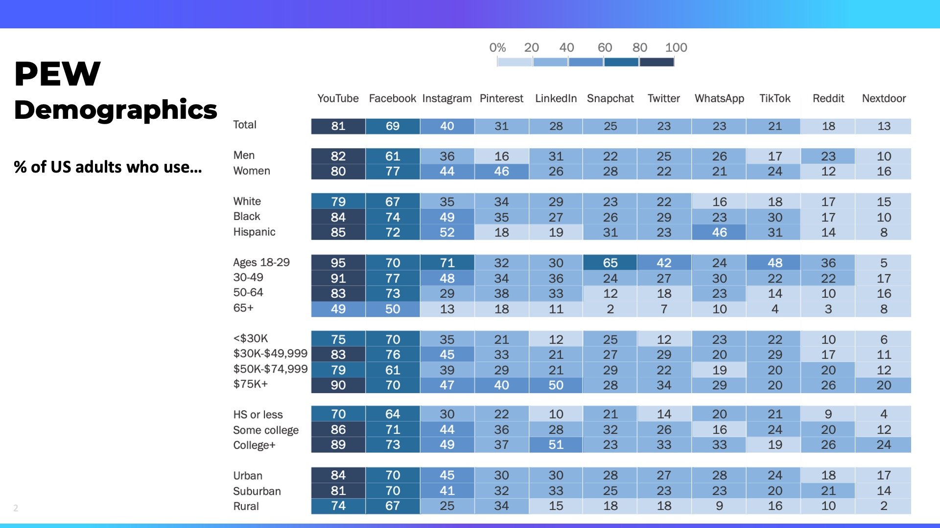
Let’s explore the Pew Social Media Survey data using Virtualitic’s Intelligent Exploration capabilities. We listed all of the dimensions collected earlier in this article but here’s Pew’s analysis of their demographic data in a 2 dimensional heatmap:
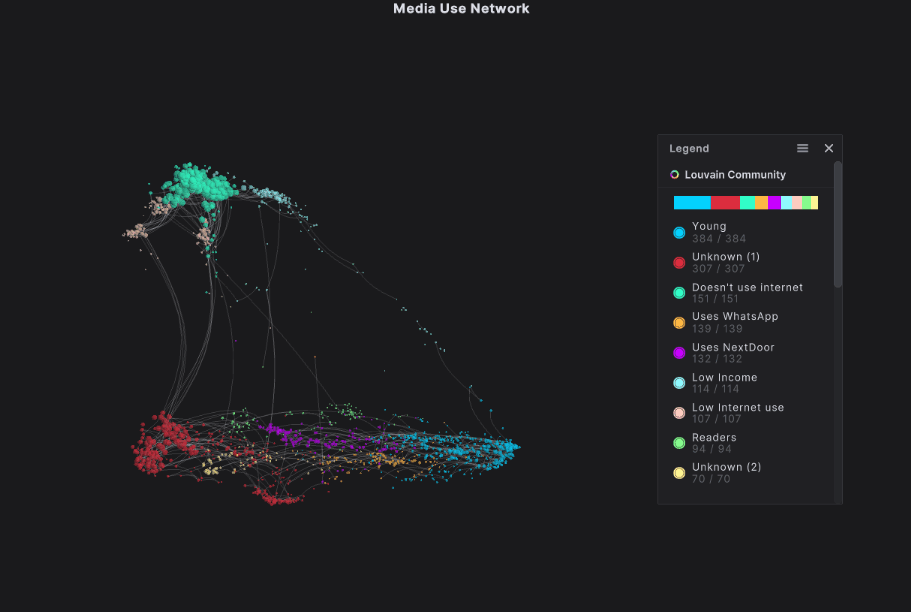
We asked the Virtualitics’ AI to look at all of the data collected (and there were 40 attributes!) and create communities of the respondents that could be visualized in a network graph. The AI-powered Network Extractor was able to sift through them all and group respondents together based on their similarities, and their differences. The end result is nine distinct communities, but it’s what defines them, and their relationships to the other communities, that’s really interesting.
|
Groups of nodes that are distinctly similar are called communities. Some communities may be highly similar and you can visually determine that because they’re tightly bunched together, while other communities have more variety between members and are placed further apart.You can learn more about network graphs and how they can be used in this blog or by downloading our eBook. |
This network graph tells us so much more about the respondents:
- That even though they were significantly underrepresented in the survey data, young people make up the largest community, suggesting that their responses are very similar. (How do we know that they’re underrepresented? We did a quick analysis of the basic demographics before we got started.)
- The Young group is characterized by the breadth and frequency of platform use. They’re most likely to use Instagram, Snapchat, Reddit, TikTok, LinkedIn, and Twitter, and to use them all quite frequently.
- There are three groups at the top: Doesn’t Use Internet (green), Low Internet Use (Peach) and Low Income (light blue). These groups are all characterized by low or no internet use. But while the Low… and No… groups are quite tightly grouped, the Low Income group is spread out and starts to reach down to the Young group down below, telling us that they are a) young, and b) have more in common with that group than with the No.. and Low.. Internet user groups. It’s quite likely that as the income levels of individuals in this group goes up, they’ll likely reflect more of the patterns of the Young group.
- There is a group for Readers–people who identify as regular readers and while it may be tempting to assume that as readers they are not internet users, the group’s positioning with the other communities characterized by internet use suggests that they are still regular internet users.
- Only two groups are defined by their use of a specific platform: What'sApp and NextDoor respectively.
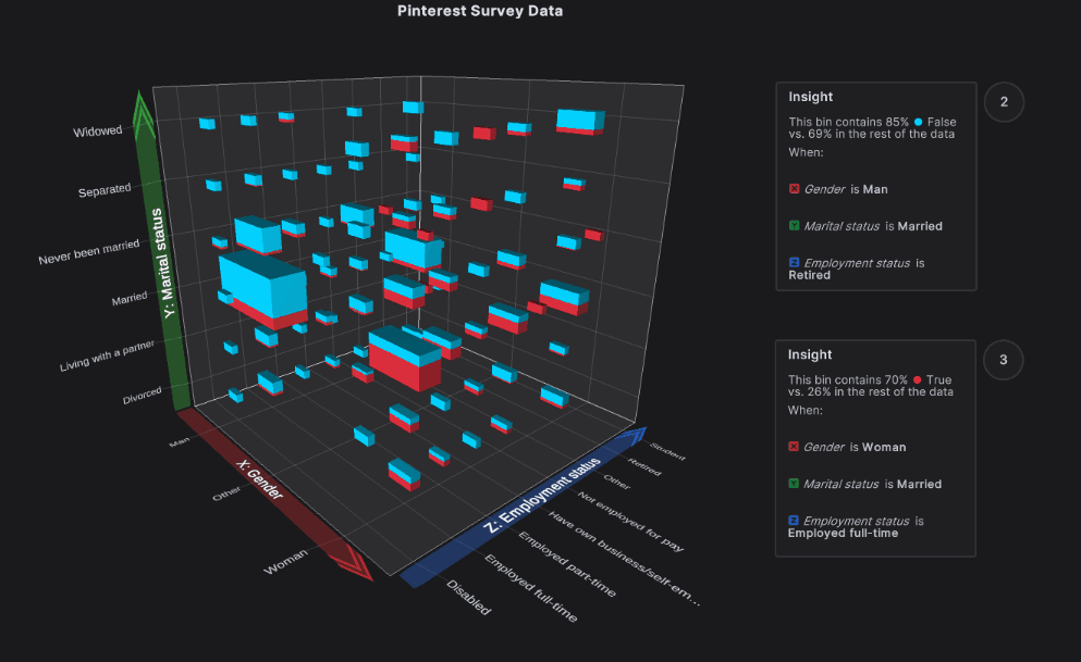
Next, we got a little more targeted and used Intelligent Exploration to determine what drove usage for each platform. These are the results for Pinterest. While it’s probably no surprise that women were the biggest users of Pinterest, when Virtualitics Intelligent Insight was used to call out the statistically significant insight, it noted that it’s not just women–it’s married women who work full-time who were most likely to use Pinterest. If you were like me and associated Pinterest with wedding planning and crafts that required way more time than I could possibly devote to them, this finding was surprising to me.
The Missing Piece
Intelligent Exploration makes it so much easier to work with complex data sets by cutting through the noise to the insight of interest, but those findings are even more usable when they’re presented in 3D.
Research has shown that information presented in 3D give consumers a 23% boost in understanding. When you’re trying to work with business stakeholders and get everyone on board with an AI solution that rests on the interplay between a number of different data points, that understanding boost is critical. You need your business and your stakeholders to understand, provide useful context, and ultimately buy-in to your initiative.
To build AI that works–or at least won’t break anything–you need to understand the interplay between dimensions. That interplay is much more clear when you can pivot the visualization. This image here is of the three basic demographic dimensions of the Pew survey data–age, income, and employment status. It’s clear which groups are over- and under-represented as we rotate the table.
Finally, when we limit our visualizations to 2D, we either limit our analysis to 2X2 plots, or we attempt to broaden the analysis, but flatten the visual, as with most common network visualization tools. But flattening something that’s supposed to communicate relationships by using proximity, like a network graph, actually distorts the information contained within. Only 3D allows for accurate illustration.
Plus, 3D is just way more fun to work with.
How Will Intelligent Exploration Transform Your Ability To Execute?
It’s time to change how we interrogate data. Our world is interconnected and we can’t afford to narrow the scope of our exploration. Intelligent Exploration–the use of AI to explore and visualize, and mine it for insight–must be the start of any data-driven initiative.
Intelligent Exploration flips the old hypothesis-driven exploration process entirely:
| 1. Observe the problem (or opportunity) | Some orders keep arriving too late! |
| 2. Gather all of the relevant data | Gather inventory, order, and supply chain data |
| 3. Use Intelligent Exploration to uncover drivers behind late orders | The biggest driver of late orders is on the order management side and changing suppliers would make no difference at all. |
| 4. Pinpoint the source and the change needed | Orders for certain parts need to be placed 4 weeks in advance to get on time and so inventory levels need to be flagged earlier. |
| 5. Move forward with a project based on your unbiased results | Develop an algorithm that tracks equipment usage and flags the projected need for the parts 4 weeks out so that the warehouse staff can order in advance to have on hand, avoiding downtime. |
Intelligent Exploration keeps your data science team focused on the right problems, and prevents issues early on instead of when an AI app is lurching towards deployment after months of investment. With a solid data-based foundation, your business can amplify the impact of your AI programs–and your business analysts. Start strong with a data-proven baseline and you will be leading the pack in successful AI.